Tutorial: mapping parcel market values in Fort Worth
In this document, we’ll explain how to carry out an “open data” workflow, similar to many of the projects we work on at the TCU Center for Urban Studies. The ultimate goal is to create an interactive map of market values by land parcel in the City of Fort Worth just like the map below:
The entire workflow is “open” – meaning that this map can be reproduced using free and open data and free software. Let’s go!
Stage 1: Data acquisition
Our data sources for this project will come from the Tarrant Appraisal District, which makes many of its spatial and tabular datasets available for analysis. We’ll need two datasets from TAD to carry our our project: a shapefile of parcels for Tarrant County, and a data table that we can link to the parcels that will give us information about the market value of parcels.
The shapefile is available from TAD’s GIS data page at http://www.tad.org/gis-data. Find the link that says “Parcels (TAD’s Parcel Base Map, 115 MB)” and click to download to your machine. Unzip and store the data in a project folder where all of this data for this workflow will go. Next, to obtain the tabular data, visit http://www.tad.org/data/downloads. Click the first option for “PropertyData(formerly AAAA.txt)” and find the link for “PropertyData-FullSet(Delimited),” a pipe-delimited dataset that can be linked to the parcel data. Click to download to your computer, move it to your project directory and unzip. You’ll have a text file, “PropertyData.txt”, inside of a folder called “PropertyData(Delimited)”.
You may notice that both the geographic and tabular datasets are quite large. The parcels shapefile is 271MB unzipped, and the text file is 524MB. While this is not “big data” in a literal sense, it is large enough that we’ll want to do some pre-processing of the data to reduce its size before visualization.
To reduce the size of the shapefile, we’ll turn to QGIS, a free and open-source desktop GIS. If you don’t have QGIS installed, you can get it at http://qgis.org/en/site/. QGIS is great at handling large geographic datasets like this, making it a good fit for our project.
Stage 2: Simplification in QGIS
Open QGIS, and add the parcels to your new project (to do this, click Layer > Add Layer > Add Vector Layer). Browse to your project folder, where you should find the “Parcels_2015.shp” shapefile. Open the file; it’ll take a few moments to render on your screen. You are displaying nearly 620,000 parcels!
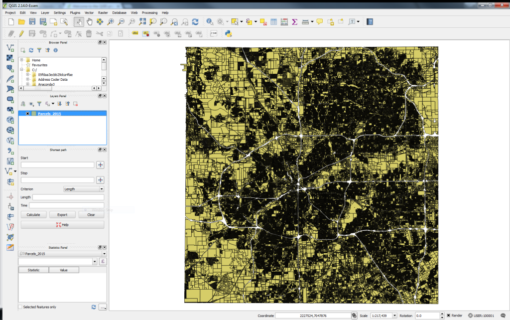
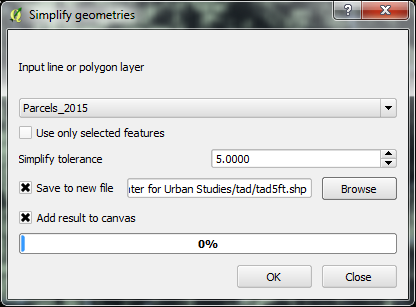
While we will want to show the individual parcels on our final map, the precise detail of the parcels is less important to us than their eventual size, given that we are producing a visualization to highlight trends across the City of Fort Worth rather than any specific parcel. In turn, we can reduce the size of the parcels through simplification. QGIS uses the common Ramer-Douglas-Peucker algorithm for simplifying geometries. To access this algorithm, click Vector > Geometry Tools > Simplify Geometries and open the tool.
The tool will default to the parcels dataset, and ask you for a “Simplify tolerance.” In a nutshell, the algorithm tries to eliminate redundant vertices within the specified tolerance distance, specified in map units. Our data is stored in the State Plane Texas North Central projected coordinate system, which uses US Feet as its units of measurement; as such we’ll enter a value in feet here, and specify the name of a new output shapefile (we’re calling it “tad5ft.shp”). Simplifying geometries is often an iterative process in a GIS; the analyst will experiment with different tolerances, trying to achieve the right balance between file size and visual appearance – as too much simplification can make your shapes look quite distorted! We’ll settle on 5 feet here; this may not seem like a lot, but it makes a big difference, reducing our shapefile from 9.5 million vertices to around 3.5 million.
Now that we’ve reduced the size of the shapefile, we’ll need to do some further data processing before the data are ready for visualization. These tasks are well-suited for R, a powerful statistical programming language.
Stage 3: Data wrangling in R
The text file we obtained from the Tarrant Appraisal District contains about 1.5 million records; this makes it too big for Microsoft Excel, which can handle just over 1 million rows. As such, we’ll want to turn to a data programming language to process the dataset. Geography students at TCU learn Python (https://github.com/walkerke/geog30323) for working on these types of data projects; R is a fantastic option as well. If you are new to R, you’ll first want to install it from https://cran.r-project.org/, and then download RStudio (https://www.rstudio.com/products/RStudio/), an integrated development environment (IDE) for R.
A full treatment of how R works is beyond the scope of this document; however we’ll explain the steps we took to process the data along with code snippets. To reproduce, place this code in an R script saved in your project directory, and run it in RStudio.
We’ll first load in some R packages with the library command; these gives us access to useful R functions beyond the base R installation. We then can read in the text file from TAD; as it is pipe-delimited, we’ll need to specify it accordingly. The dataset is big – but it can be reduced considerably as we don’t need all 1.5 million records and 56 columns in the dataset; just those records in the City of Fort Worth (identified by the code ‘026’) and columns that identify a parcel ID and its value.
We now read in the spatial dataset we processed in QGIS. A warning – R is slower than QGIS for reading in shapefiles with lots of features! Be patient here. We then use R to reduce the size of our spatial data even further; operating here on its tabular data. We remove parcels with a PARCELTYPE of 2 (denoting empty tracts), and keep only the TAXPIN and CALCULATED columns, which represent the ID of the parcel and its acreage.
Next, we need to match the parcel shape data with the parcel value data. We use the geo_join function in the tigris package developed by our Center director, Kyle Walker (https://github.com/walkerke/tigris); this package is primarily for working with geographic data from the US Census Bureau, but can also help with other spatial workflows in R. We merge the data based on the ID columns, and specify how = 'inner' to drop all of those parcels that don’t match the records for the City of Fort Worth in the tabular dataset. We then then look to generate a new value per square foot column; we’ll drop parcels with an acreage of 0, then make the calculation.
Our data are ready to go! First, let’s explore our value/square foot column a bit to get a feel for what we are working with.
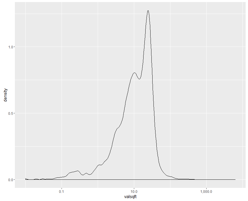
Our data have a distinct positive skew; we have an interquartile range of 5.4 to 23 with a median value of 12, mostly representing the large number of residential properties; the long tail of values to the right tends to represent high-value parcels in and around downtown Fort Worth. We can plot the distribution of values with the x-axis on a log scale to make the shape more visisble. With this information in mind, we write out our dataset to a shapefile, and then zip up the constituent files that make up the shapefile (the files with the ‘fw_parcels’ prefix) manually. We’ve now reduced our data to a 16MB zip archive!
Stage 4: Visualization in CartoDB
To create the interactive visualization, we turn to CartoDB, a web-based platform for geographic visualization that can handle our large number of parcels quite well. CartoDB offers a free plan with 250MB of space to get started, with paid plans available if you need more space.
Once logged in, drag and drop your zipped shapefile onto your CartoDB data dashboard to add the dataset. CartoDB will take a few moments to load the shapefile and convert it into CartoDB format; CartoDB uses PostGIS as a backend, so it is creating a cloud-based spatial database for you!
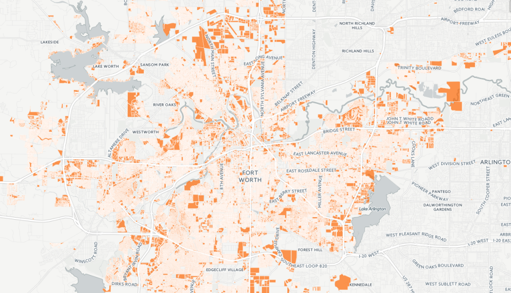
You’ll see your data appear as a database table; click MAP to view its geography, as in the image above. You can style the map here; however we’ll first click VISUALIZE in the upper-right corner, creating a map that gives us more options.
Once your map is created, you have a lot of options for interactively visualizing your map. Here’s how we did ours:
- We changed the basemap to “Dark matter (lite)” – which lets our parcels pop out against the dark background.
- Using the “wizards” tab, we selected the choropleth visualization option, which allows us to show statistical variation with colors on the map. We selected the “valsqft” column from the Column drop-down menu, and changed the color ramp to a blue-green-yellow scheme so that high-value parcels would be highlighted against the dark basemap, and set the Polygon Stroke to 0 to remove the parcel borders.
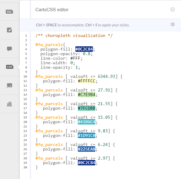
- As CartoDB wasn’t calculating quantiles the same way as R, we adjusted the bins manually to the R quantiles using the CartoCSS tab, which allows you more customization over your styling using a CSS-like syntax. Custom color schemes can be incorporated in this way as well by modifying the color hex values. Granted, this isn’t perfect – the top septile has a very wide range of values – but it does allow us to show variation on the map more clearly.
- We set a tooltip to appear on hover from the “infowindow” tab. To get this just right – which included adding a dollar sign before our numbers – we modified the HTML directly, which CartoDB allows users to do.
- We made a few small changes to the choropleth legend, specifying the direction of the colors and a title; legends can be customized extensively from the “legends” tab.
- Finally, we modified a few of the options for the map’s appearance, allowing for scroll wheel zooming and popping the map out to full screen.
We chose to stop there with the map; however there are many ways to customize maps from CartoDB beyond this and incorporate them into web applications; see CartoDB’s documentation at http://docs.cartodb.com/cartodb-platform/cartodb-js/ for examples!