Mapping the presidential election in Dallas-Fort Worth
November 11, 2016
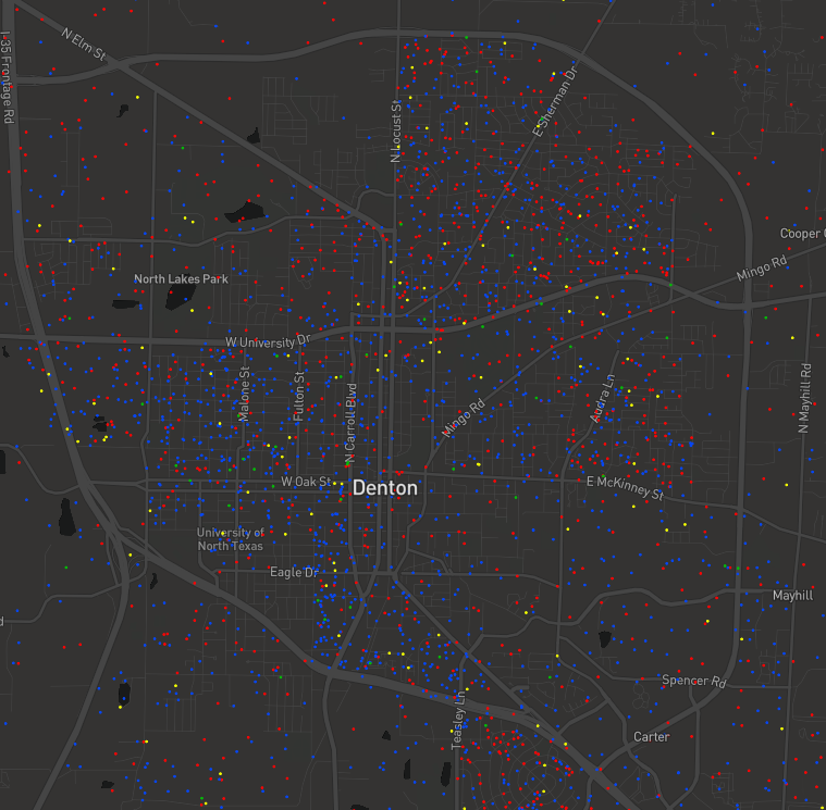
As the dust settles on the 2016 presidential election, many pundits and academics alike are trying to make sense of the surprising results in the presidential race. TCU Center for Urban Studies Director Kyle Walker (Geography) and Center for Urban Studies affiliates Emily Farris (Political Science) and Sean Crotty (Geography) teamed up to visualize the presidential election vote in the Dallas-Fort Worth metroplex with the 2016 DFW Election Dot Map. Click the link or the image below to explore the map.
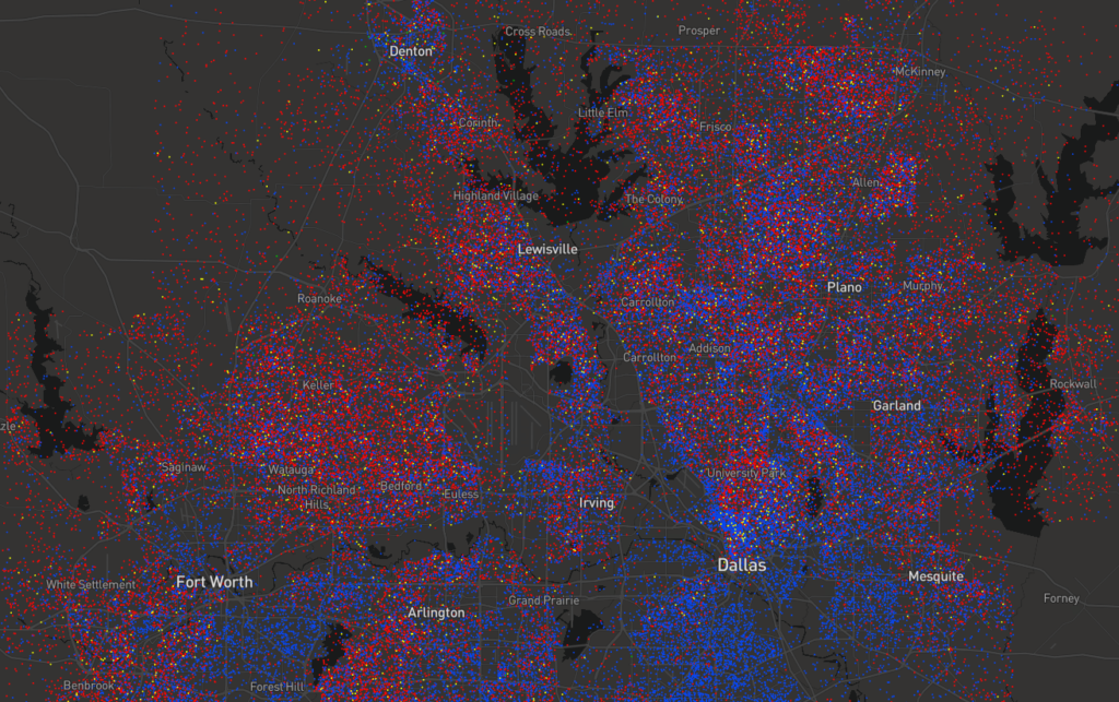
The map is based on precinct-level election data from Tarrant, Dallas, Denton, Collin, and Rockwall Counties. Dots are placed randomly within electoral precincts, and represent approximately 25 votes when zoomed out and 10 votes when zoomed in. As such, dots do not represent the residential locations of actual voters, but instead provide a representation of the general geography of the presidential vote in the Dallas-Fort Worth metroplex.
While Trump’s win last Tuesday marked 40 years of Republican success in Texas, some analysts questioned whether changing demographics and increases in both urbanization and the population might put Texas in play for the Democrats in 2016. Trump won 53% of the vote overall in Texas, but lost four of the five counties with the largest populations in the state by a little over half a million votes. For perspective: Romney won of 57% of the vote in 2012, and similarly lost four of the five urban counties, but only by a total of 130,000 votes.
| 2016 | 2012 | |||
| Trump | Clinton | Romney | Obama | |
| Harris | 544,960 | 706,471 | 586,073 | 587,044 |
| Dallas | 261,865 | 458,845 | 295,813 | 405,571 |
| Tarrant | 345,683 | 288,001 | 348,686 | 252,789 |
| Bexar | 240,161 | 319,191 | 241,617 | 264,856 |
| Travis | 126,759 | 306,475 | 140,152 | 232,788 |
| Texas | 4,681,590 | 3,867,816 | 4,569,843 | 3,308,124 |
In Dallas County, Clinton’s margin of victory was nearly 6 points higher than Obama’s in 2012. Obama won Harris County (Houston) by only 971 votes in 2012, while Clinton won with 161,511 votes. Democrats saw a nearly 14% increase in the number of voters in Tarrant County (Fort Worth), the one large urban county to go Republican in both 2012 and 2016. These tallies suggest something interesting for urban Texan voters in 2016.
Two of the state’s large, urban counties, Dallas County and Tarrant County are home to the Dallas-Forth Worth (DFW) metroplex. Among the five counties analyzed as part of our 2016 DFW Election Dot Map: Dallas, Collin, Denton, Tarrant, and Rockwall, there are 6.3 million people in the metro area, up 6% since the 2012 election. DFW is one of the leading metro areas in the U.S. in population growth, second to only Houston. The Dallas-Fort Worth region is expected to grow to 10.5 million people by 2040.
| White | Black | Latino | Asian | |
| Dallas | 32.0% | 21.8% | 38.8% | 5.4% |
| Collin | 61.5% | 8.7% | 14.9% | 11.9% |
| Denton | 62.8% | 8.3% | 18.7% | 7.0% |
| Tarrant | 50.5% | 14.9% | 27.3% | 4.8% |
| Rockwall | 73.3% | 5.2% | 16.5% | 2.2% |
| Texas | 44.3% | 11.6% | 38.2% | 4.0% |
Source: U.S. Census Bureau, 2010-2014 American Community Survey 5-Year Estimates
Like Texas, the area’s population is diverse, with a large number of Latino residents, particularly immigrants, in the region. Across the five counties in the metroplex, there are 1.7 million Latinos, nearly one million African Americans, and nearly 400,000 Asians. DFW is segregated by race, as seen on the Racial Dot map, as well as by class. Dallas-Fort Worth ranks fifth nationwide in family income segregation. Rockwall and Denton Counties rank among the top ten counties for highest per capita income in Texas, while neighboring Dallas ranks highest in the country for childhood poverty.
To analyze the 2016 presidential vote in the Dallas-Fort Worth metroplex, the 2016 DFW Election Dot Map uses precinct level data from the recent election to represent the concentration of Trump, Clinton, Johnson, and Stein voters as dots, colored according to the candidate. We offer some preliminary thoughts about the election, using the map to visualize data from the 2016 presidential election in the Dallas-Fort Worth region.
As the table below indicates, Trump won a majority of the vote share in four of the five counties we look at in the Dallas-Fort Worth region, with a total of 1,005,514 votes. Clinton won only Dallas County, receiving 747,116 votes throughout the DFW area.
| Trump | Clinton | Johnson | Stein | |
| Dallas | 34.9% | 61.1% | 3.2% | 0.8% |
| Collin | 55.2% | 38.5% | 3.8% | 0.7% |
| Denton | 57.7% | 37.5% | 3.9% | 0.9% |
| Tarrant | 51.8% | 43.1% | 3.6% | 0.8% |
| Rockwall | 70.8% | 24.0% | 3.2% | 0.5% |
| Texas | 52.6% | 43.4% | 3.2% | 0.8% |
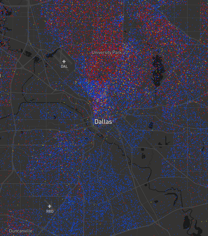
One suggestion for Trump’s victory is the urban-suburban-rural divide among voters, with a large turnout of rural voters. National exit polls suggest that Clinton won voters in cities with populations of over 50,000 people by a margin of 24 percentage points. This trend is evident in some parts of the Dallas-Fort Worth area. While the city of Dallas voted largely for Clinton, we can see strong support for Trump in Dallas’s suburban counterparts of University Park and Irving.
This urban-suburban pattern is a little less stark to the west in Tarrant County, as a number of voters within the city of Fort Worth voted for Trump, but suburban North Richland Hills, Colleyville, and Keller show more red dots than blue.
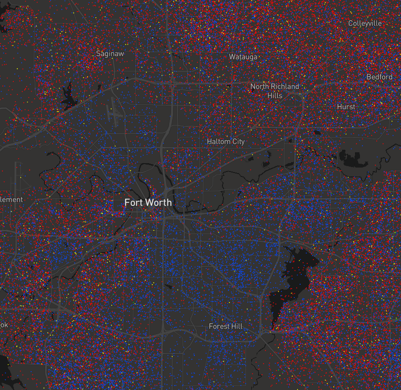
Trump also did well in the less dense parts of the metroplex, such as Azle in northwestern Tarrant County or northern parts of Denton County, or eastern Rockwall County.
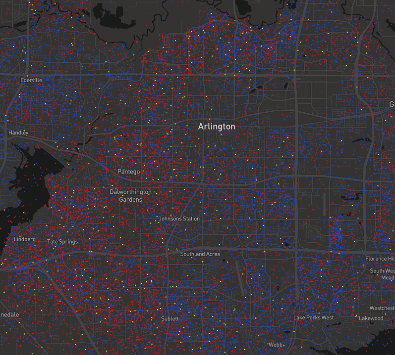
Another explanation for Trump’s success rests on the role of race and racial and ethnic anxiety among his supporters. Racial attitudes predicted Trump support in the Republican primary, and initial analysis of exit polls show that Trump received a broad coalition of support from white Americans. Our map of the vote in the Dallas-Fort Worth shows some clear division by race and ethnicity across the region. African Americans in south Dallas largely supported Clinton, as did voters in the largely African American Dallas suburb of DeSoto. The western portion of the city of Arlington, which is less diverse, has more Trump supporters than the eastern half of Arlington where more Latinos and Asians live.
Similarly in Fort Worth, areas like the largely Latino North Side neighborhood were more supportive of Clinton than the primarily white neighborhoods in the western part of the city. In Collin County, the cities of Plano and Allen, which are more diverse suburban areas, show a mixture of support for Trump and Clinton.
With voters’ distaste for both Clinton and Trump, some analysts noted the higher than usual levels of support for third party candidates like Libertarian nominee Gary Johnson and Green Party candidate Jill Stein. In Texas, Johnson received about 3% of the vote, up from 1.1% he received in 2012, and Stein improved from 0.3% to 0.9% of the vote. The only county in the DFW metroplex where Johnson and Stein outperformed their general Texas numbers was Denton County, perhaps unsurprising with the presence of a large public university and environmental frustrations over fracking.
Visualizing the Dallas-Fort Worth region’s presidential election votes can help us make sense of some of the explanations for Trump’s surprising win last Tuesday. We can see some clear patterns of vote share based on urban-suburban voters and voters’ race and ethnicity, which reflect similar visualizations from 2008.
You can find us on Twitter, as we continue to explore the data from the 2016 DFW Election Dot Map. What patterns do you see?
Emily Farris, @emayfarris
Kyle Walker, @kyle_e_walker
Sean Crotty, @SeanCrtt